May Butterflies Paint Along
In May (a few years ago now), I created a paint along challenge. Below I describe the process and everything you need to complete the challenge yourself. Join my mailing list via the form below to get a copy of the design to print at home. You can also find videos of the tutorials on my Instagram (you might have to scroll back a bit!).
The materials you will need:
The design printed on watercolour paper.
Join my mailing list below to receive the password to my freebies page & the design.
I used 300gsm rough watercolour paper in size A6.
Spare piece of the same paper.
Pencil and ruler.
Water.
Blotting paper (spare kitchen paper or fabric scrap).
A paintbrush with thin end.
I used a size 4 round paintbrush for all but the lettering, for which I used a size 0 round.
Watercolours.
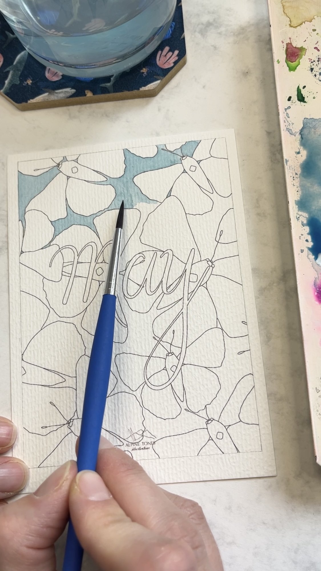
Creating a border.
Unless you have printed the design borderless it won’t reach the edges, so first we will create a border. Use your pencil and ruler to draw a thin line joining up the printing and leaving a small white border at the edge of the painting. This also enables you to frame your finished piece and still see the whole design.

Outlining the border.
Keeping the border clean.
If you are worried about keeping a clean border at the edge of your painting, stick your paper down to the surface you are working on with some masking tape or washi tape. You can paint over the top of the tape, no problem at all. Be gentle when slowly peeling off the tape at the end so that it doesn’t rip the paper. This works best with thick paper (300gsm, definitely not 80gsm printer paper). You could also use masking fluid (see below).
Masking fluid.
For this painting I did not use masking fluid. However, if I had chosen to keep the lettering white and not paint it, then I would certainly have used masking fluid. This is an opaque liquid that you paint on before commencing the project. You are able to paint over the top of it, therefore easily enabling you to have very clean lines (so long as you have painted it on smoothly!) Once the piece is finished, then you can carefully rub it off with an eraser.
Before you begin painting.
Before you begin painting, I recommend testing out the colour on a spare piece of the same paper to see what it is going to look like and see if it is the right shade for you. Once you’re happy, go ahead and start painting!
The background.
Starting with a big white page, even with a printed design, can sometimes seem a bit daunting so what I like to do is get a big block of colour down first. I chose a pale shade of blue for the background.
When painting larger areas like the background, you may find small lines form where wet paint slightly overlaps dry paint. To remove these lines, dab away at it with a wet paintbrush to soften it and then add in a little more watercolour on top. The beauty of watercolours is that they can be quite textured so do take lines like these as part of the finished piece, don’t be too worried if small lines or variations in the colour remain.
Small lines form where wet and dry paint overlaps.
When it came to painting the background next to the antennae of the butterflies, I didn’t paint straight over them with the paintbrush, instead I painted right up to the edges so that the printer ink wouldn’t bleed too much across the page.
I used 300gsm watercolour stock so I could use a fair amount of water without the paper buckling. If you are using thinner paper, then do be aware of the amount of water you are using so that the paper doesn’t buckle. Remember to test it on that spare piece of paper first.
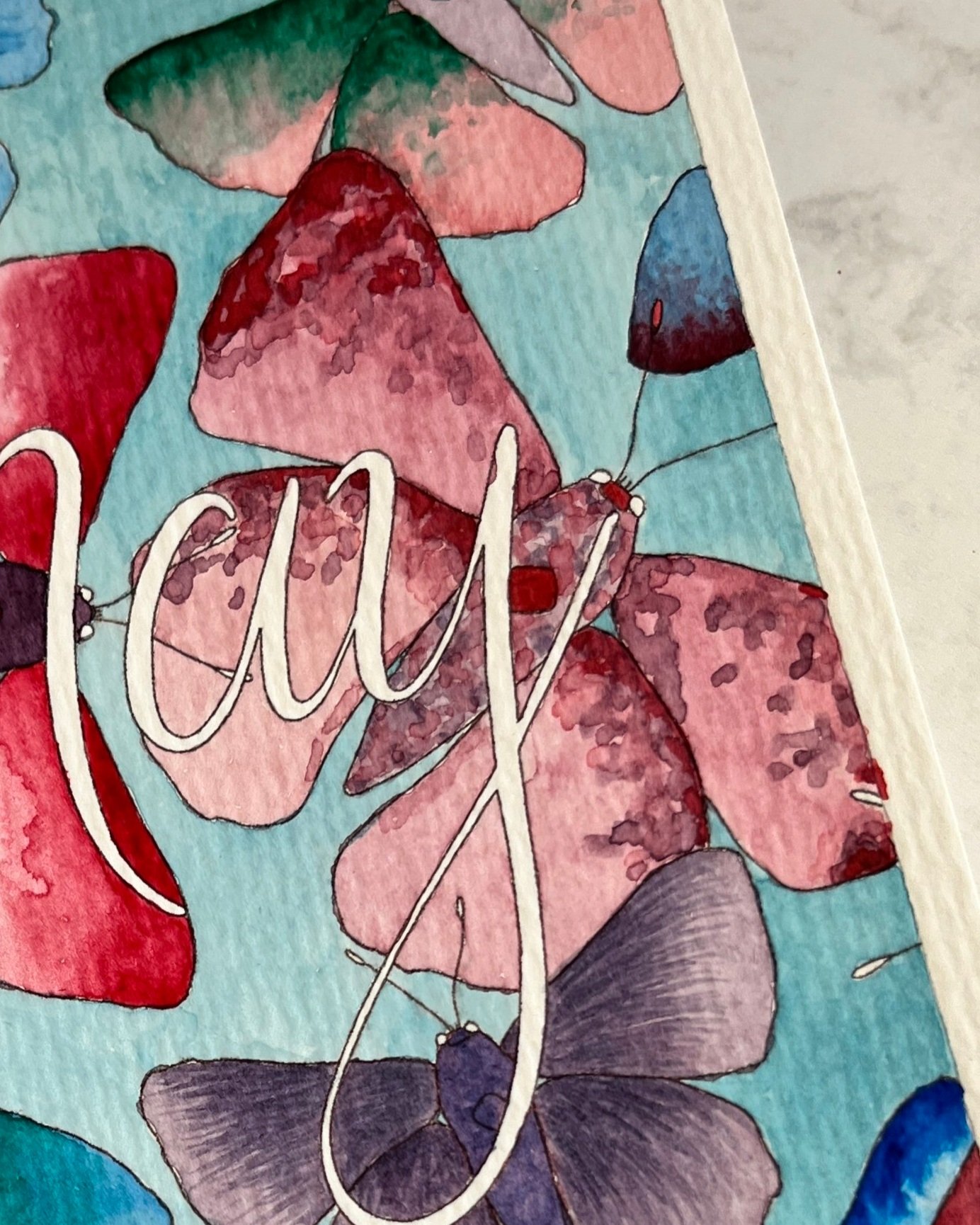
The butterflies.
Now it’s time to give the butterflies some background colour, so mix up the colours you would like to use. For some butterflies I painted a simple wash for the first layer. For some I went straight in with an ombré effect.

Creating an ombré effect.
For this effect I used the pigment straight from the watercolour pan. This way the colour will be more vibrant and the paint will be thicker on the page. Start by painting a thin line along the top of the wing. Now wash and dry off your paintbrush a little and use it to drag the paint down the page. And then add a little water from the bottom of the wing to help the paint bleed down the page. Dry your paintbrush off again and drag the colour further down to the bottom of the wing. Add some more paint into the top if you need to.
You can also add an ombre effect on top of a wash. For the butterfly at the bottom left I painted a background wash in blue, and then the ombré effect in green over the top so that the colour bleeds from green to blue rather than a dark blue to a pale blue as with the previous butterfly.

Painting an ombré effect.
Do be careful when you are doing the ombrés that if you start on an adjoining wing before the previous one is dry then the colours will bleed into one another and you will lose some of the ombré effect. Be patient. Or do one wing from one butterfly, one from a second, and then come back to the first in order to give the paint time to dry in between.
Using fine strokes.
Take a look at the blue butterfly at the top and purple butterfly at the bottom of the image below for this. Make sure you are using a paintbrush with a very fine tip to create this effect. Starting from one point or edge, and using a fairly dry brush, layer up the colour with lots of very fine strokes. This works beautifully with multiple shades and/or colours layered on top of one another.

Using fine strokes.
A mottled effect.
For the pink butterfly centre right, I used a mottled effect. I created this using lots of little dabs of watercolour with the paintbrush. I started with layer of pink, then once dry, a layer of purple, and then a a vibrant red as the last layer. You can be quite loose and messy with the paintbrush. It doesn’t have to be too precise.
For the purple butterfly bottom left of the final painting, first I painted layers of fine strokes, then once completely dry, I painted one layer of the mottled effect over the top.
The mottled effect.
The butterfly bodies.
For the bodies of the butterflies, I used the darkest shade from the wings or the same shade from another butterfly. For a few of them I used the same mottled effect as on the pink butterfly right of centre. If you layer up lots of colours when doing this, as I have, then wait between layers if you don’t want them to bleed into one messy brown shade, or at least wait for the paint to partially dry so that it only bleeds in small amounts.
When you come to paint the ends of the antennae and the eyes, don’t use too much water or it may blob onto the paper. For the antennae I used colours I had already used throughout the painting and yellow for the eyes.
The lettering.
If you have used masking fluid, then now is the time to carefully erase it. If you are painting the letters, then I recommend using a thinner paintbrush. I used a size 0 rather than the size 4 that I had used for the rest of the painting. The lettering will probably take longer than you think and requires patience and a steady hand! If you have printed on A4 paper, then it will be much easier than my A6 piece! ;)

Painting the letters.
The final touch.
Once you have finished, prop your painting up a little distance from you. By standing back from your painting you can decide if there are any extra details you want to add, for example more mottled detailing on the bodies.
I hope you enjoyed reading about and following along with my painting process. Do let me know if you complete the challenge, I would love to see a photo of your finished piece.
Take a look at my tutorials page for more opportunities to paint with me.
