Alpine Tones Illustration: Inspired by Zermatt
Nature inspired art painted with love in Zermatt, Switzerland
My Brand Story
Art is always something I loved and despite having the talent for it, I had not previously pursued it as a career. After a lot of reflection and changing times - I’m writing this in 2021 - here we are, with the Alpine Tones Illustration doors open for business!
Over the past few years, much of the population has come to realise that we are doing a lot to destroy our planet. I hope that through focusing my art on the wonders of the world I can spread a little knowledge, love and appreciation, as well as spark reactions that make changes for the better.
I have an eye for detail and this is reflected across all my work. From painting alpine plants and flowers seen only in this area of Europe, to drawing amazing underwater creatures that only scuba divers or David Attenborough fans normally see, love and attention to detail is poured into every piece.

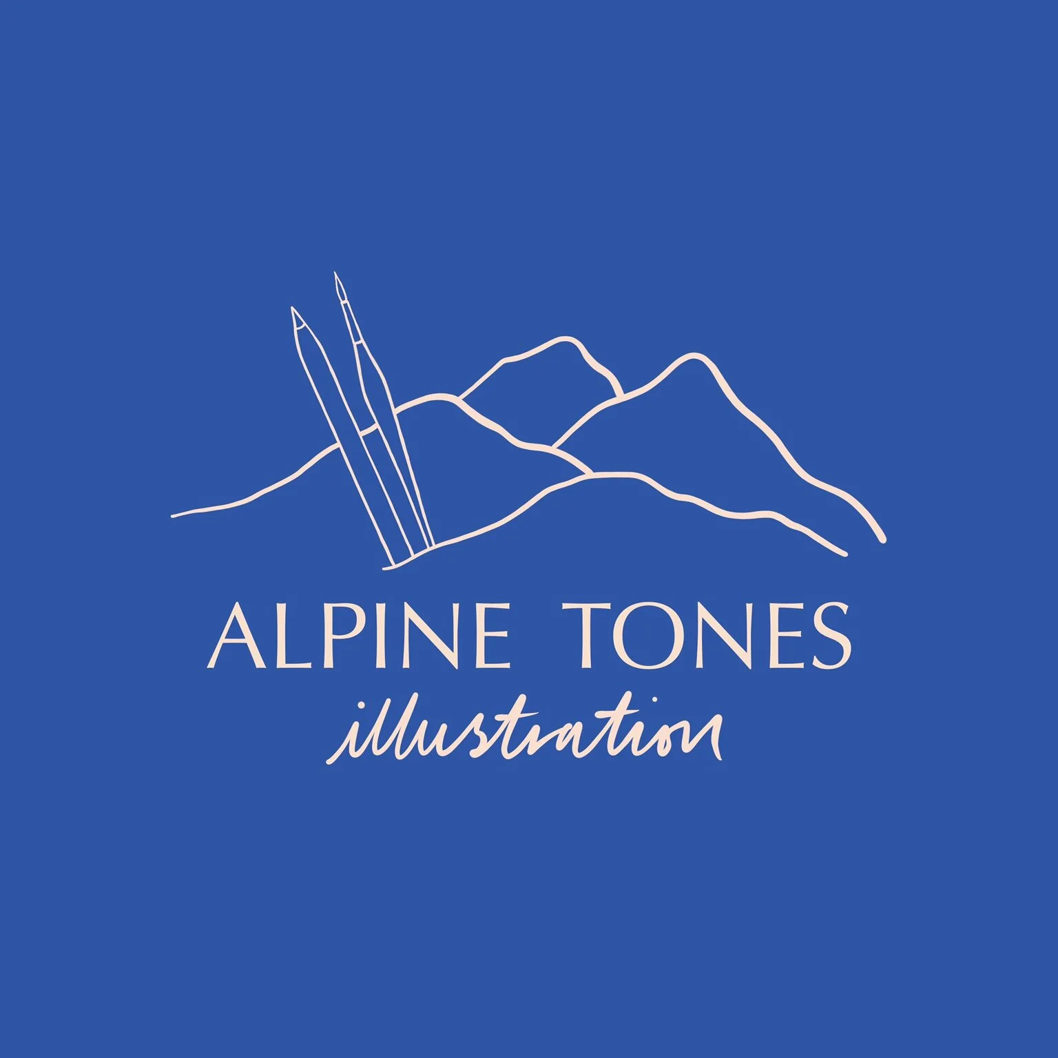
My Logo: incorporating my love for the Alps
The Alpine Tones Illustration logo had to of course reflect the business name and what I do. I included a paintbrush and Apple Pencil as these are my primary tools. The mountain illustration is based on real mountains in the Swiss and French alps. They are stylised versions and certainly not in height order, so that they are not immediately recognisable. This is so the logo is relevant for customers around the globe, but also personalised to me and where the business began.
Mont Blanc: It was in the shadow of the Mont Blanc that the seed for this business dream was planted. At 4809m, it is the highest in the Alps.
Matterhorn: As a Zermatt based artist, the Matterhorn had to be included. Not the view from Zermatt town, but the view as you travel on the ski lifts towards Cervinia. So many brands around the world have included the north face of the Matterhorn in their logos and on their packaging, so I chose the southeastern face to be a little different!
The Dom: Contrary to popular belief, the Matterhorn is not the tallest of the Swiss Alps. At 4545m, the Dom rises just 67m higher than the Matterhorn, and is the highest mountain located entirely in Switzerland.
Dent Blanche: One of my favourite mountains to see whilst skiing in Zermatt. The Dent Blanche (aka. white tooth) and the Rimpfischorn are two of the most distinctive (after the Matterhorn of course!) so they are always easy to point out to visitors.

My Brand colours: inspired by Zermatt
Alpine blue: The decision to choose this shade of blue was influenced by many things: days when you can’t see a single cloud and the sky is such an unbelievable bright blue, the Spring Gentian flowers (Frühlingsenzian) that pop up all over the hillsides as the slopes begin turning green in spring, and of course my love for the ocean.
Peachy pink: This colour can be spotted all around the mountains once you start to look out for it. Streaked through the fluffy clouds at sunrise and sunset, in the bare rock across the mountainsides, in many of the alpine flowers, and also in the snow when storms are swept this way from the Sahara Desert!
Accessibility is important to me, so I also spent a lot of time using contrast checker software to ensure these colours worked well together.
Throughout the year I will be adding a few highlights of other colours depending on the season. From rusty orange this autumn, to icy blue in winter, be sure to look out for these other touches of colour and the stories behind them.
Read about the materials I use here: